Stretching my art practice
...and taking my time over it!

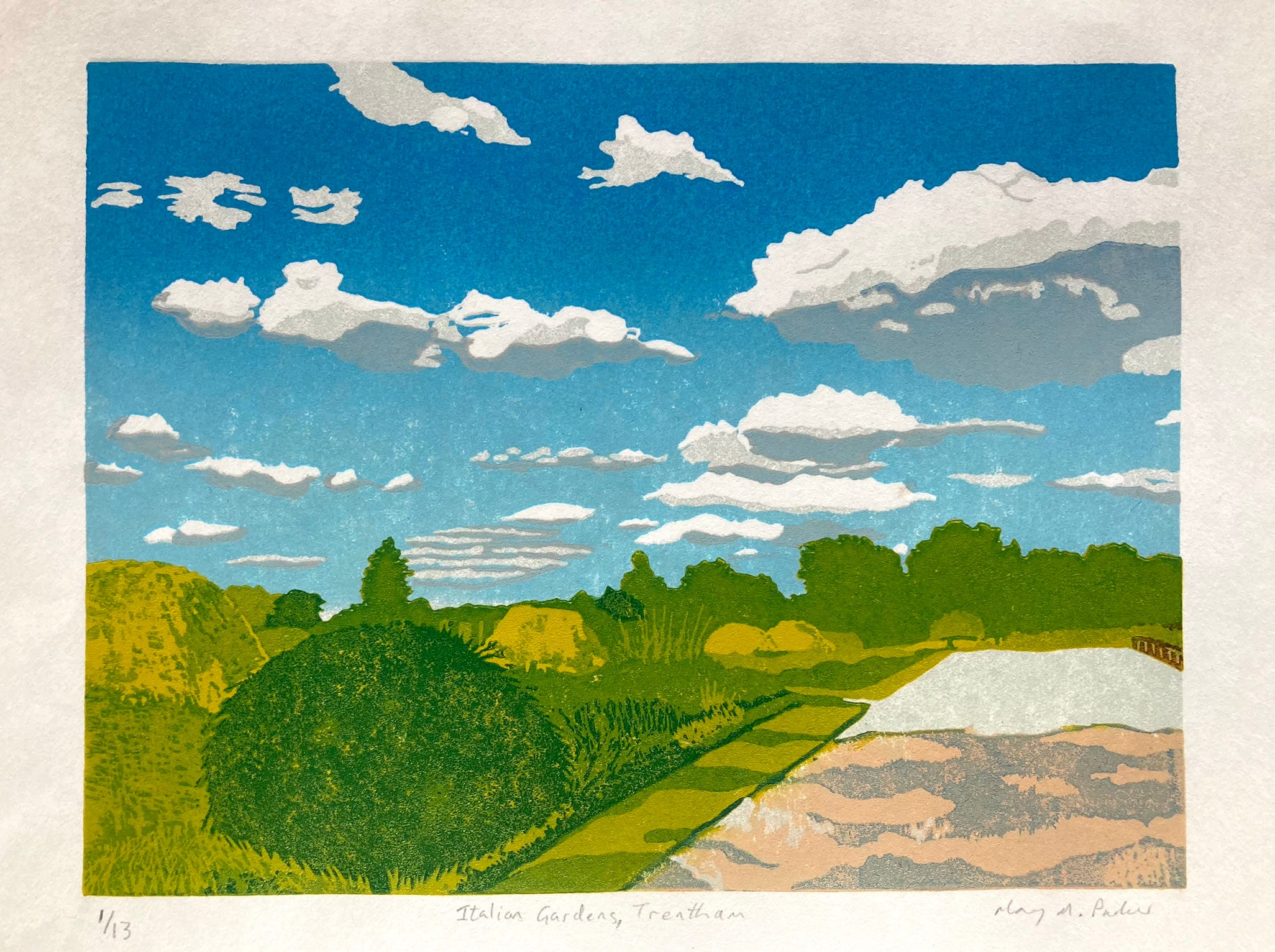
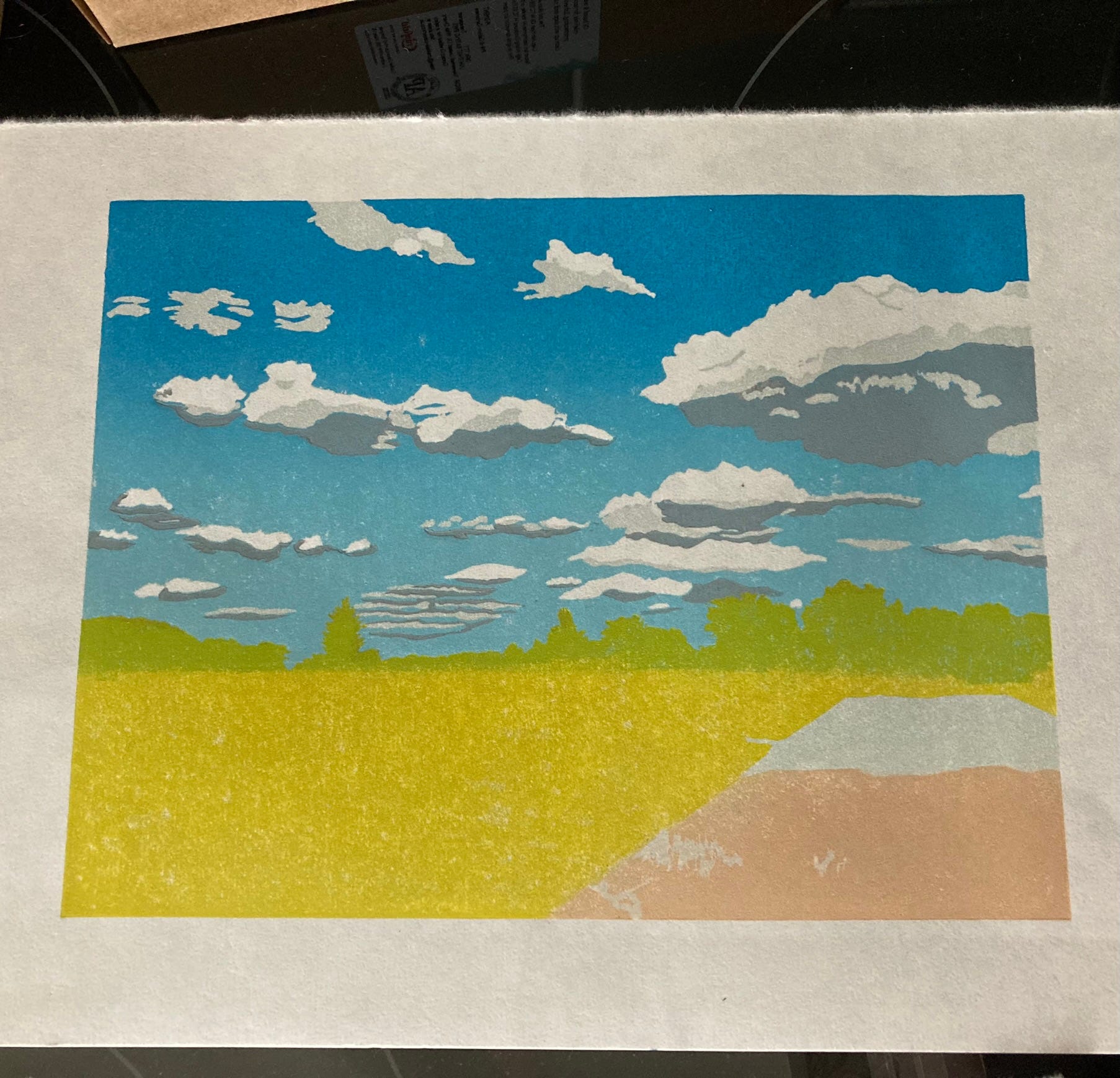
In July 2022 I took a series of photos on a visit to Trentham Gardens (which if you read my previous post you'll gather that it's one of my favourite places locally). One of those images became a stand-out for me and made it initially to my desktop background, where I stared it down trying to break it into printable layers for a reduction linocut, which is my current favourite method of hand-printmaking. I strongly doubted my ability to do it justice, so I shelved that idea for a few months.
For the uninitiated, a reduction print can be made with a linocut or a woodcut, printed by hand with a baren or using a press. It involves only one block, and as the name suggests, it is gradually reduced during the process of printing. The print taken from the block will have at least two colours, and can have into the teens of overlaid layers. Instead of having a separate block for each colour, more is cut away from the single block for each successive colour, so you can imagine the planning that has to go into this. Once you've cut lino away, it's very, very difficult to glue it back without it showing. Eventually when all of the layers are done you're often left with nothing but the last little bits of shadow to get printed, with what's left of the lino being totally unrecognisable as an image. Original linocuts or woodblock prints made in this way are very limited editions, as they can never be exactly replicated once the block is effectively destroyed.
In spring 2023 I made a decision to commit to this. The vital points were the sky, and the varying shades of green in the trees and borders. I began on the drawing, and had transferred it (in reverse, as the printing process requires) onto a 15cm x 21cm/A5 grey linoleum block by April 4th. I'm grateful for having a photographic record of the stages, and that each one carries a date in its digital make-up…
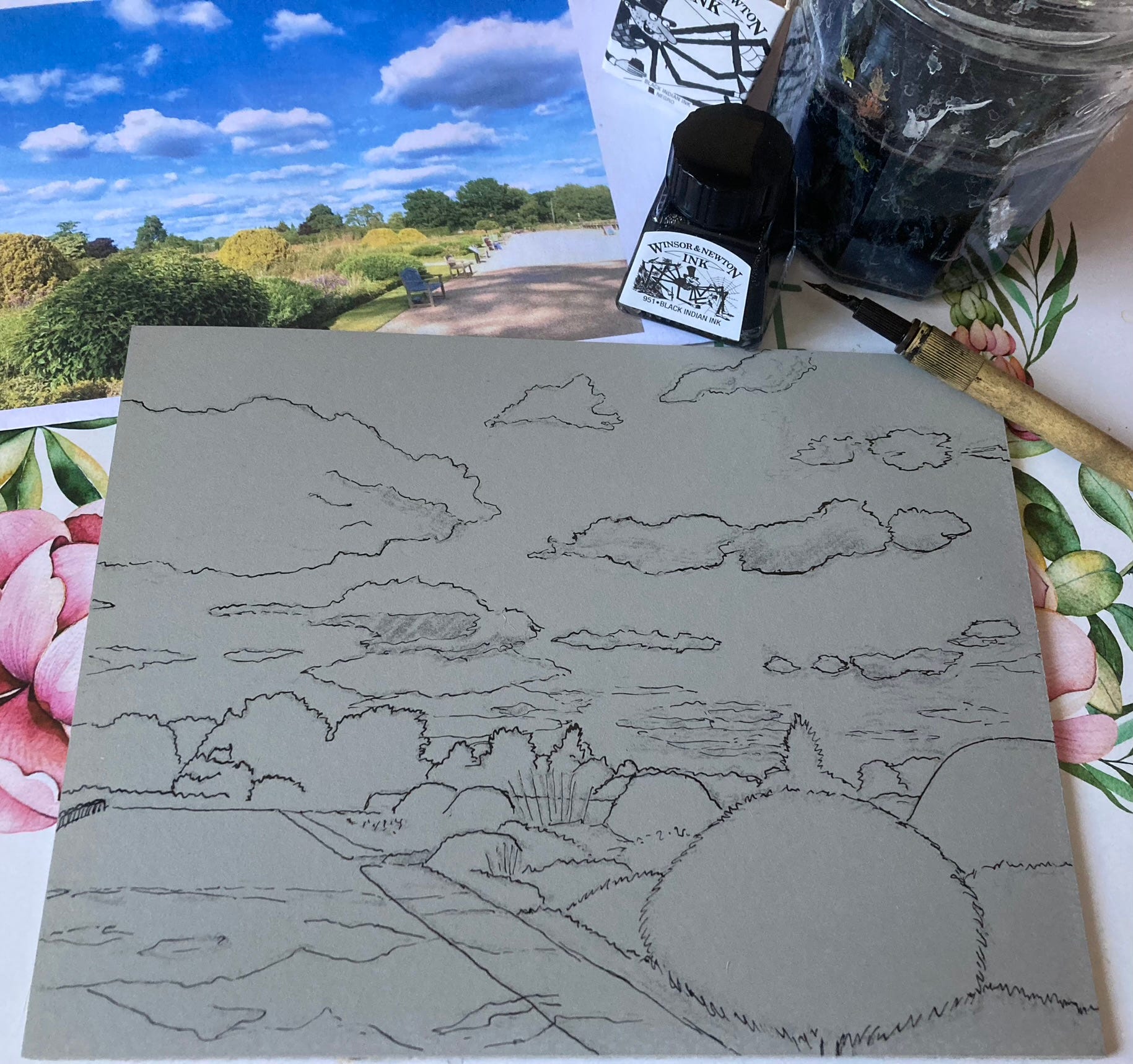
So the block sat, and waited, then waited some more until I felt brave enough to start carving, as the clouds were first on the schedule. During those months, I made several other simpler linocuts and even tried my hand at rudimentary collagraph, with limited success. In August, I finally felt equal to the task and made a few dents where the white of the cloud would be, created by the paper itself showing through. It would be another month until I actually got ink on the block, a pale grey which was the first layer on the clouds.
The ink dried for a couple of months, (not because the inks I use demand it - I use Caligo Safewash relief ink which can take a little while to dry but not that long!) then more carving led to the graduated blue sky in October. At this point I made a rookie error, by stopping the blue at the horizon line. When using transparent ink this is a Very Bad Move, which would become apparent later on in the process.
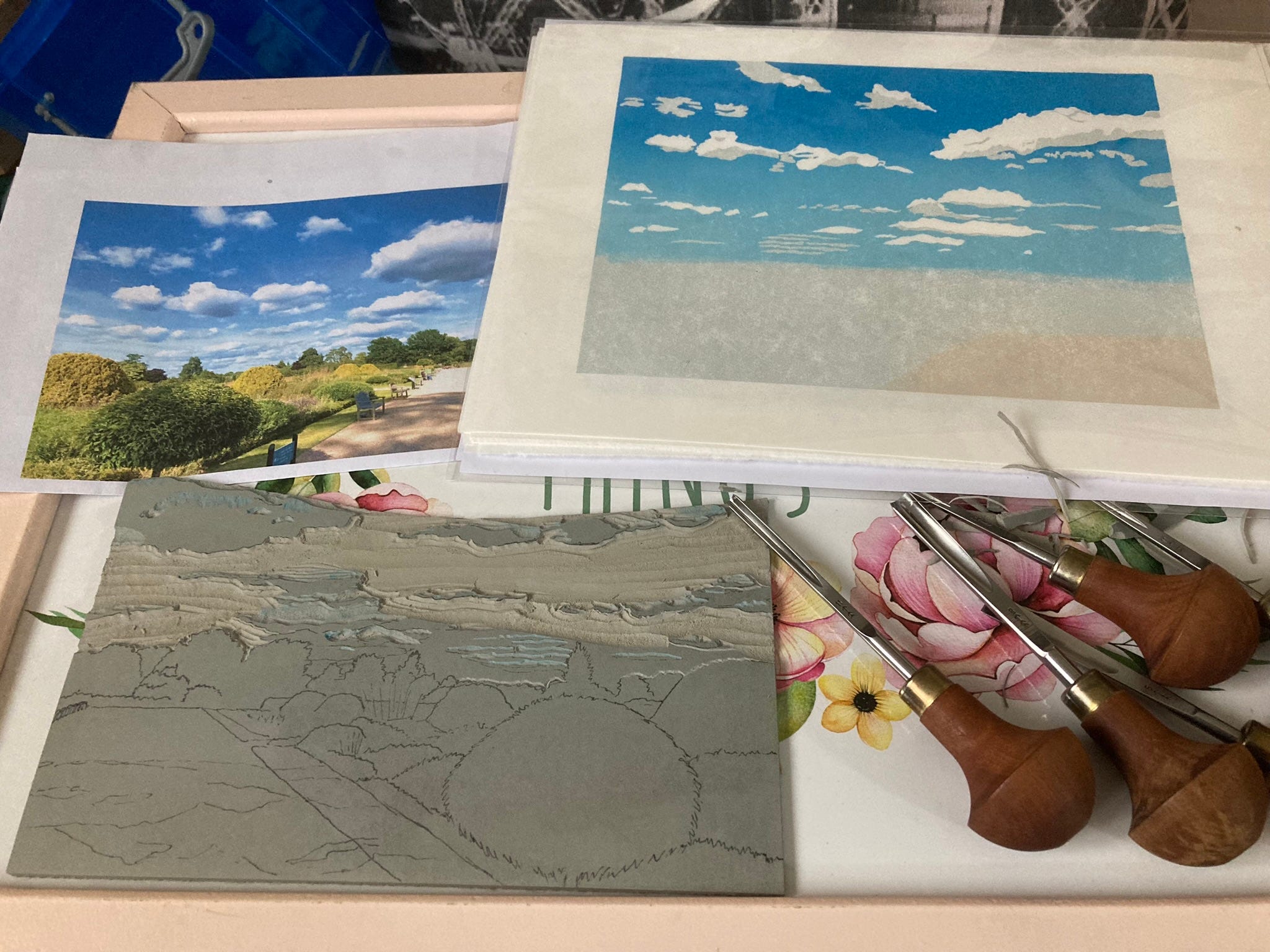
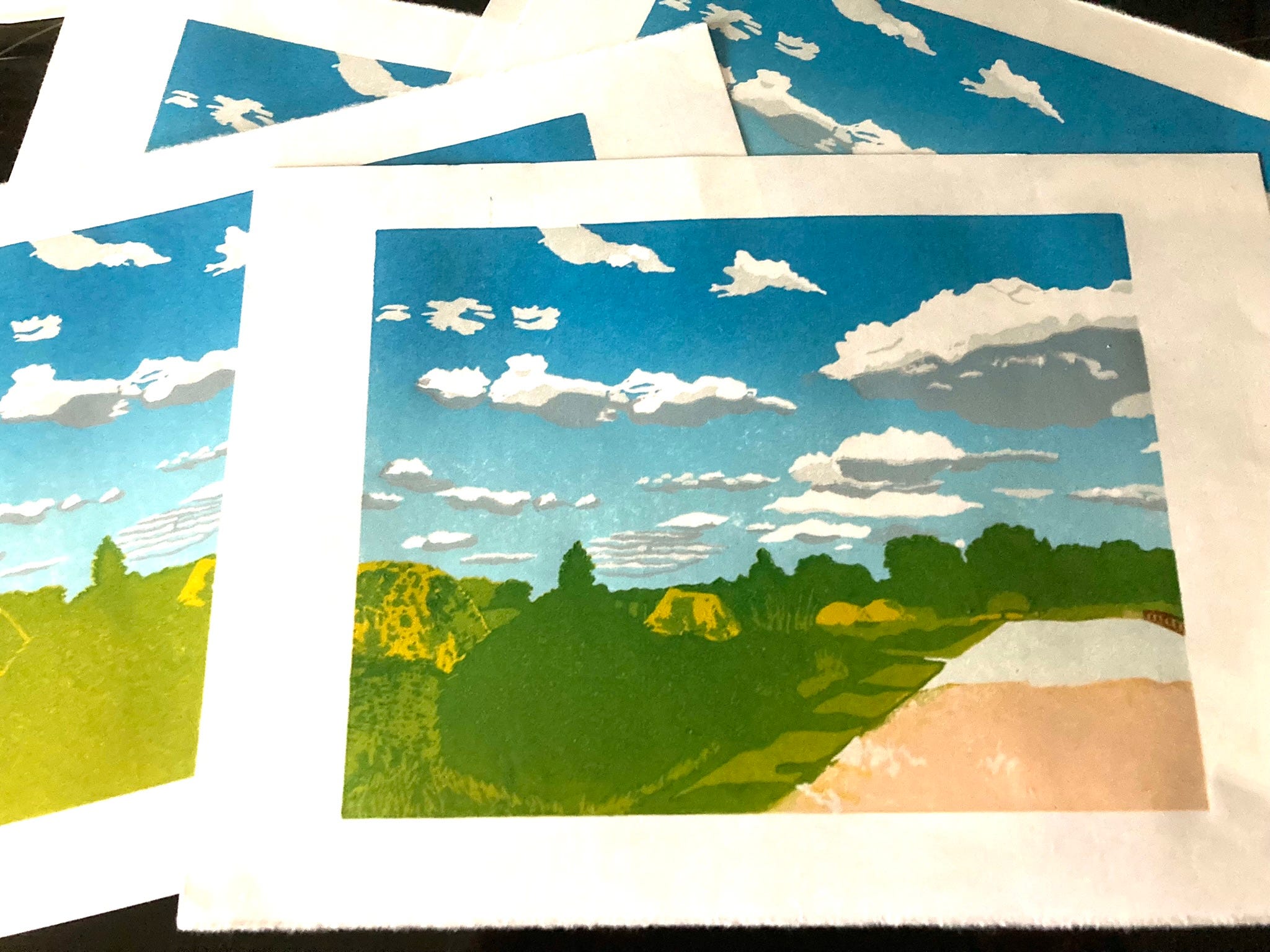
In November, the darker grey appeared, to give more form to the clouds. At this point, the sky was finished, and was removed almost completely from the block, so as to prevent ink being rolled onto an inconvenient piece of the lino. Getting green ink on the already completed sky was NOT an option! It wasn't until the first of January 2024 that I discovered the dread Horizon Line that shone through the layer of limey green, intended as an undercoat for the diagonal of the four golden yews.
During January, I got a good amount done, somehow - by the 27th I had done a second much thicker layer of the lime green which thankfully obscured the awful horizontal line through the bushes. The downside was that the ink was so thick that it left raised edges around the trees. I didn't dare blot the excess ink off as I feared that line reappearing, so there's rather more texture in this print than I had wanted. Still, generally the next layer of darker green worked well to peg the lime back.
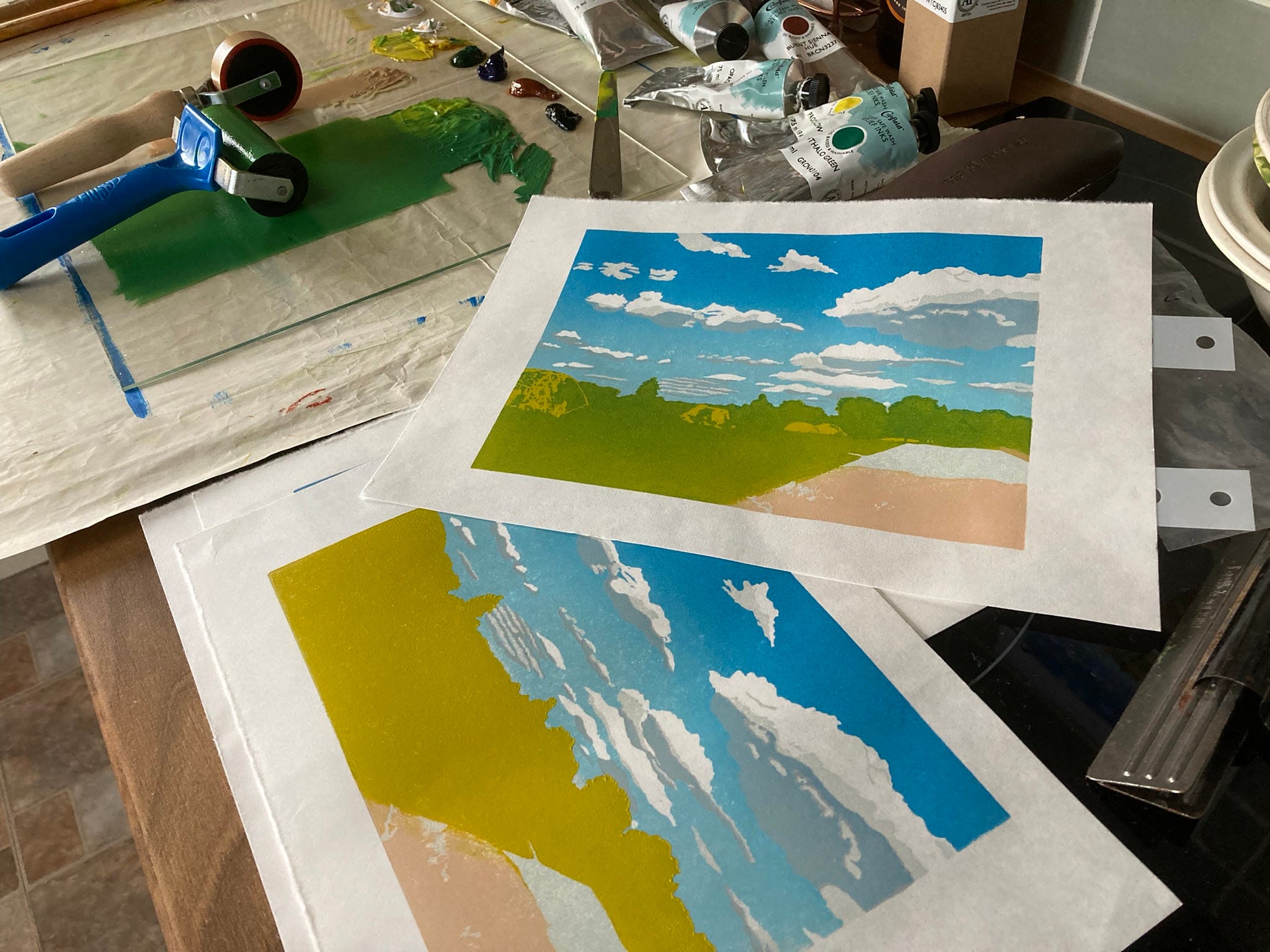
I left it to dry out for a couple of weeks, and carved away what would be the penultimate layer in the meantime. On the 17th of February the next layer of slightly darker green went on. I have been experimenting with mark-making on this one, and a lot of the built up texture was made by rocking the end of a flat carving tool back and forth, walking it across the areas that I wanted to look roughly leafy.
I wanted to keep it simple, and suggest different surfaces rather than go into minute detail. This one is about colour and depth rather than botany. I also finally got the tiny bit of balustrade detail in on the right hand side. A this point, as with most of the layers, I was worried about completely wrecking the print with the next, final layer.
So, the final layer is usually the one with all the fine detailing on it. If there are going to be outlines, this is where they will be. In this case, I had defining lines of shadow to very carefully carve around on the grass verge, areas of shadow to delineate on the path, and most worrying of all, how to convey the leaves on the small tree in the foreground without making a total mess of it. I desperately wanted to finish this one before the end of March, as I wanted to enter it into the Derby Open print show, and the deadline at the end of the month was looming ever larger. I sat and stared at it, and as I thought of the other print that I'm hoping to enter for the same show, I was inspired - I didn't need to carve the leaves.
Using ink mixed with a good ratio of extender, about 50/50, the final layer was textured enough to suggest the presence of leaves in a gentle way that fitted in well with the rest of the image. To say that I was relieved is an understatement!
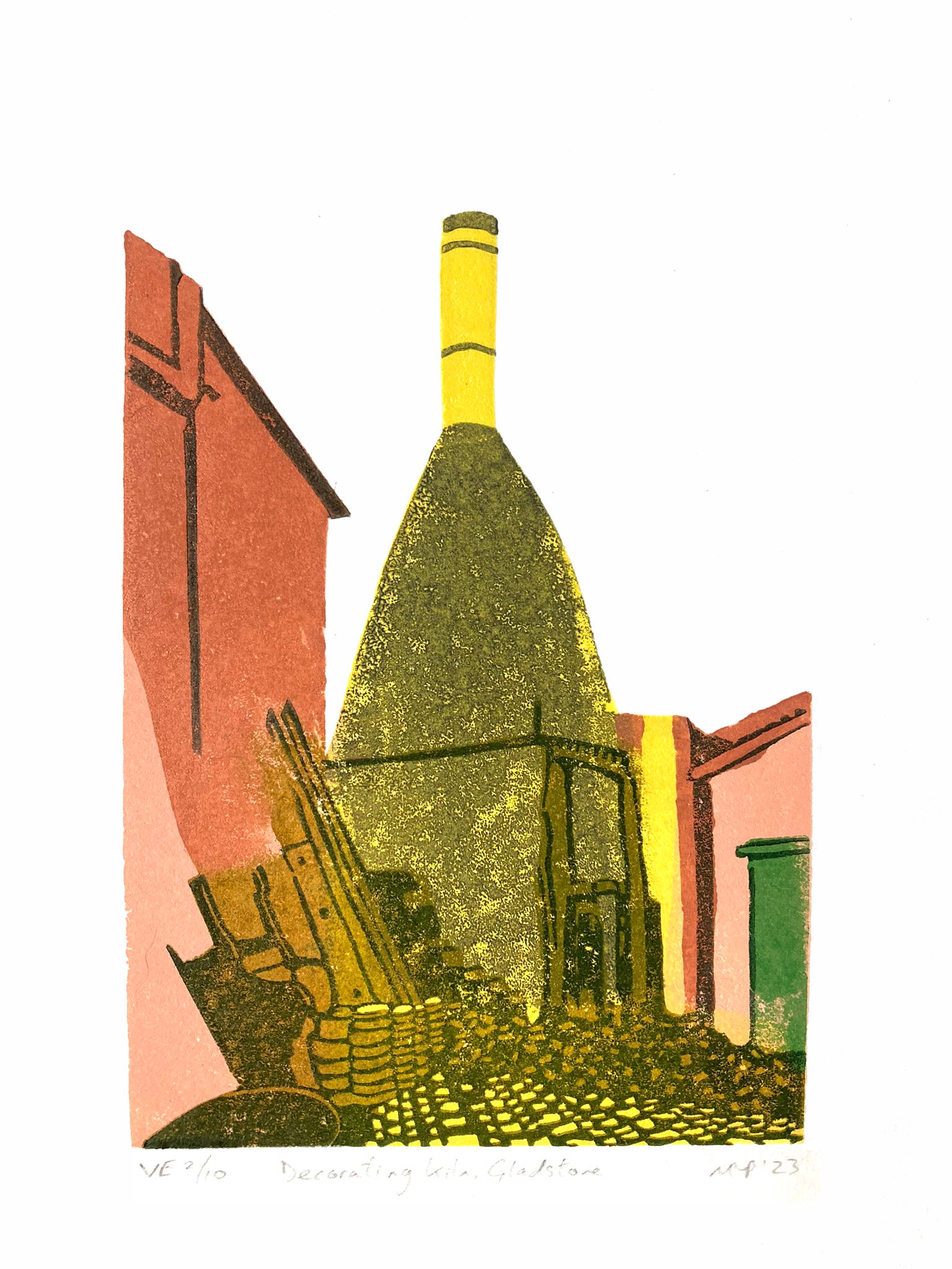
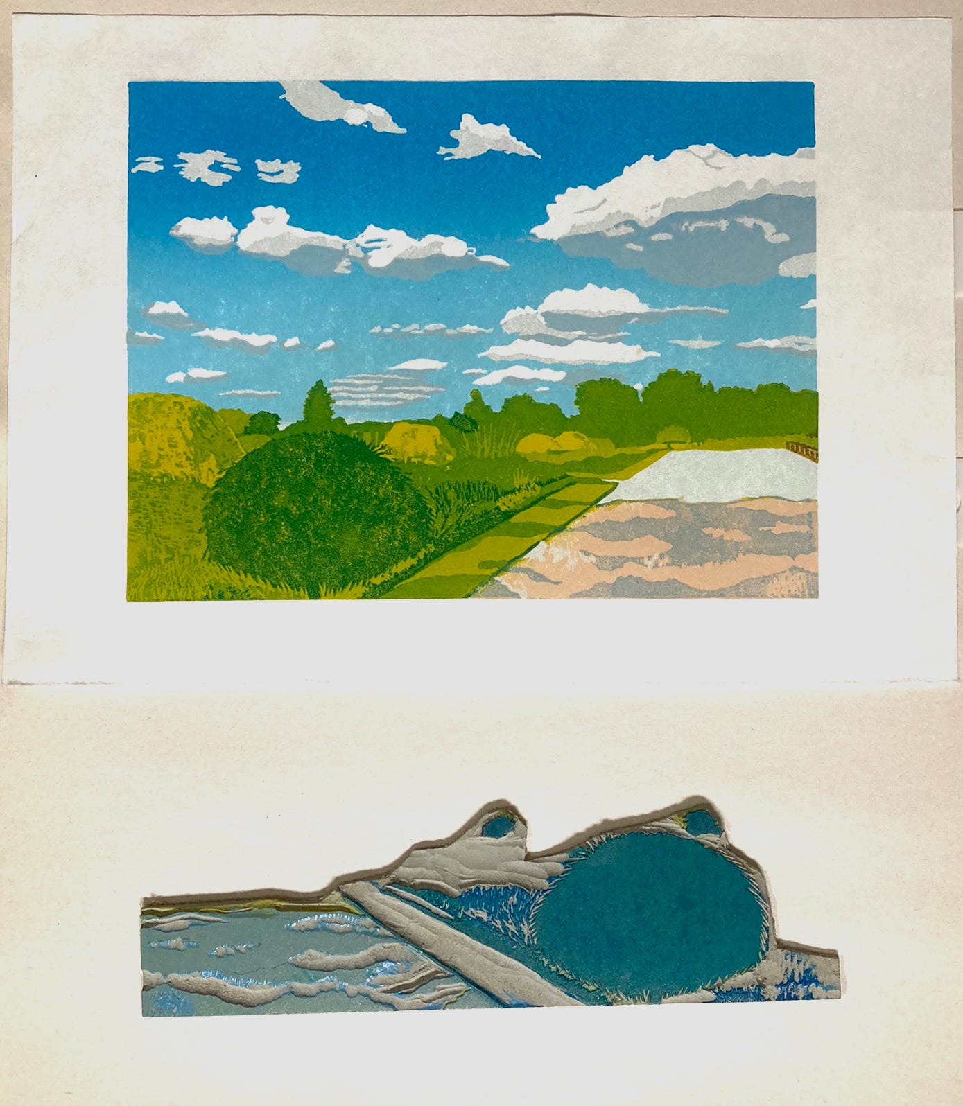
The official completion date of the linocut was the 20th of March 2024, around a year after I started the drawing. I got my entry in, now I just have to wait patiently to see if they accept either or both of the linocuts. This is the other one, the smallest of the bottle ovens at Gladstone Pottery Museum. This is part of an ongoing series of the last remaining 47 pottery bottle ovens in Stoke-on-Trent, more on these in a post coming soon!