
Printing Twyfords
Twin bottle kilns by the water


Twenty years ago, I took some photos of the remaining bottle kilns at the old Twyfords ceramics factory in Cliffe Vale, Stoke-on-Trent. The abandoned factory stood on the opposite bank of the Trent and Mersey canal in the process of noisy demolition, and my husband and I stood in Hanley cemetery, having just visited my mother’s grave. The two flint kilns were built joined together and were now supported by scaffolding, as they were to be preserved, along with the historic frontage on the main road. They were perfectly reflected in the water on an almost still, grey day and made a quietly dignified sight - an old couple determined to stand with their walking frames, refusing to be told that they should take it easy, holding their heads up high amidst the destruction.
Over the next few years, we saw the land around them being developed for much needed housing - a complex of low rise flats grew up, sympathetic to their surroundings. The kilns now stand, free of their scaffolding and fully restored, as a piece of public art in pride of place next to the canal towpath, a plaque telling a little of their history, and with listed building status. Boats pass by regularly, the weeping willows on the cemetery side make it all very picturesque, and the smoke-ridden toxicity of the old kilns is long forgotten. There are kingfishers along the canal, Mum would have loved walking down there and spotting all of the wildlife. The kilns demurely sink into their surroundings, camouflaged occasionally by an infestation of buddleias which need to be professionally removed once in a while.
I’ve had a framed monochrome photograph of the scaffolding-clad kilns on the wall for years, and I’ve been staring it down all that time as I planned my strategy. Having begun the long task of making a linocut record of the 47 remaining kilns and ovens in Stoke, these have always featured on the to-do list, even after I made a simple small representation of them in shades of green a few years back with the flats in the background.
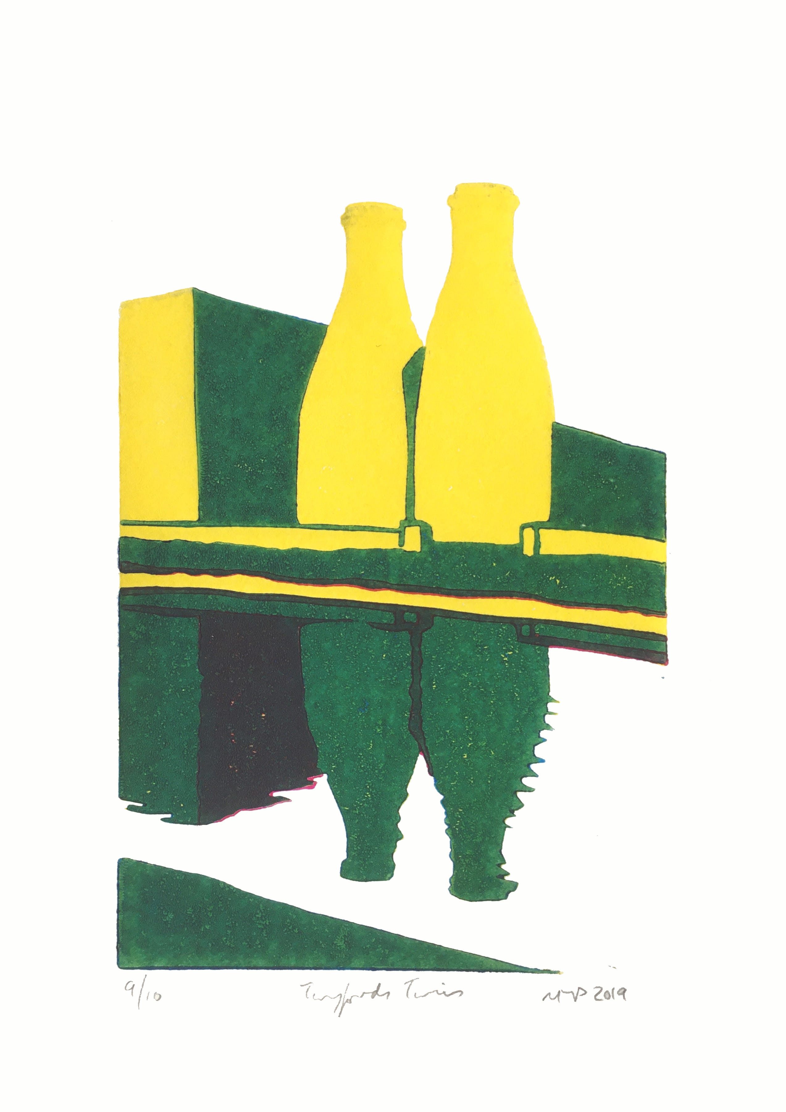
It always felt like a temporary placeholder to me though as in my head, the ‘real’ version was stewing away until I had the right skill level to at least make a try of it.
My last pottery linocut turned into an aubade, a dawn tone poem to the old teapot factory whose silhouette I left without troubling it with fiddly detailing. There is a connection between the two works though as I decided to borrow the dawn theme for ‘Supported 4’. It felt the right time, having had a rest from fiddly to bite the bullet at last. So I scaled up the drawing that I had started in 2023 to A4, traced it off and transferred it. The plan was to print a light shade for the scaffolding, then cut away all of the metal posts outside and inside the structure. The next colour would be a mid-tone, then cut away the kilns, then print the platforms darkest.
I chose to make two versions. In my head the photograph had suggested ‘pagoda’ very strongly, so the first one was going to be yellow, red and jade. The other would be a more natural, dawn palette with a background colour, making it necessary to print this before any carving was done. So the first session was a ‘rainbow roll’ which was intentionally slightly different for each of the seven prints. As my largest roller is just over 5” wide, I could mirror the sky in the canal by turning the roller 180.
I hung these up to dry, then I cut away the sky around the tops of the scaffolding at both ends of the design on the linoleum. These are extremely thin lines, and the registration - matching each layer up - would be absolutely critical as these lines had to match through the process of printing three colours. Nerve wracking! I’m very thankful that early in the process I realised that the masking tape holding my registration jig together had begun to loosen so I replaced the tape, very gradually and carefully to avoid shifting. Thankfully this all held and there were to be no problems at all which for me is pretty much unheard of! I use Pfeil linocutting tools, and hone them constantly to keep them sharp as I work.
I printed the next layer, a very light grey, over the rainbow roll. The scaffolding could be seen around the outside of the kilns. Having cleaned up the block, I then printed a bright golden yellow first layer for what was planned to be the pagoda version. The next thing to do was to cut away the visible scaffolding around the edges, but cut out the scaffolding within the confines of the kilns. However, I kept thinking how nice the grey scaffolding looked. I gave in and cut some more paper, and the monochrome version was born, despite the possibility of contamination from either of the others as inevitably there would be remnants of previous layers’ ink lurking in crevices. As it turned out, there’s very little visible, thankfully.


Next it really was time to start cutting away that fine linework around the kilns. I had to start on the interior bits first though, because of the importance of lining up the metal bars’ lines precisely. You can hope for a little help from the brain in assuming a continued line, but there comes a point where a badly lined-up vertical or horizontal can draw the eye and it becomes a very unwanted focal point. It took several sessions to complete the job, but the next layers of all three were then printed: on the naturalistic one, a clay coloured pair of kilns with a scaffolding tracery. On the light grey, a detailing layer in mid-grey. On the yellow, a bright red produced by printing process magenta over it.


Back to the cutting mat again. I knew exactly what my intentions were for the final layer, I’d planned it all out in my head right from the start. The bottle kilns were to be cut away to leave the platforms, which would be made a tonally darker shade to emphasise the kilns. Now bear in mind that all of these colour variants are being printed from one unique lino block, so any change will affect all of the different versions. Half way through the carve, I woke up to the somewhat traumatising realisation that I had in fact cut the inverse - I was busy meticulously cutting away the platforms. The primary reason for wanting to have them was to complete the pagoda version as the verticals were to be red, and the horizontals jade green. I stared at the half finished job in disbelief. I put the block away for a while as I processed the sudden alteration.


The work that I had already done was hanging up drying, so I sat looking at them, trying to imagine what they’d look like if I went ahead with the block as it now was. I wondered about recutting the whole thing, but realised that trying to line up all of the scaffolding would be well nigh impossible. The damage was done on the 13th of February. It took me a week to restart cutting, which I eventually completed. The editions were finally finished on my birthday, the 25th - my big blow-out gift to myself was a four-hour (at least) printing session which would comprise partly of me deciding that the jade was too painful on the red and yellow and switching to a very dark purple which, to all intents and purposes, now looks more like black. I had them all hanging up on the over-door rack, and had them all on probation as I was still very annoyed with my mistake.


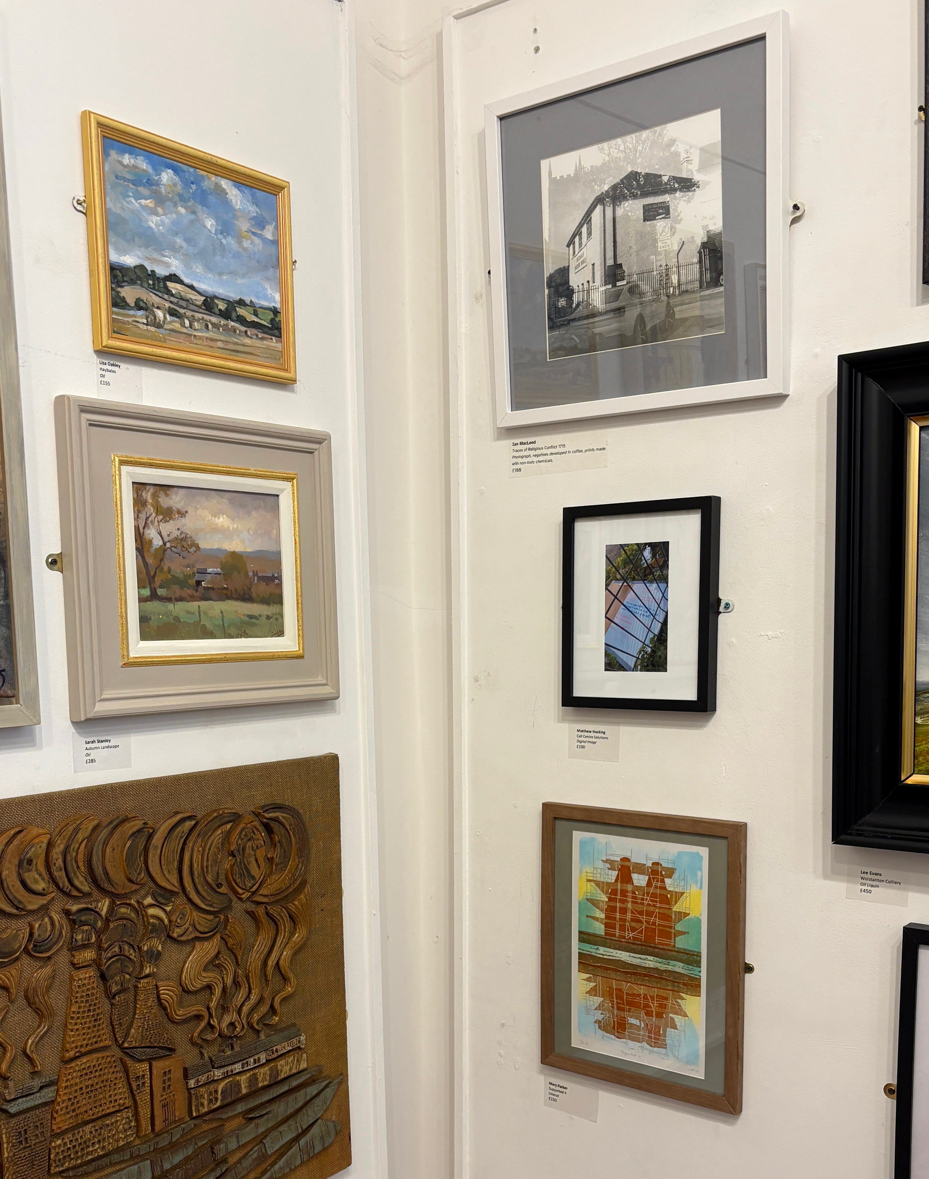
As it is said, however, time is a healer, or maybe it’s more like getting accustomed to change. I have made peace with them. The naturalistic one is a varied edition of six, due to the different background of each one, the monochrome ones are all pretty much uniform and an edition of six, the jade ones are an edition of three, and the purple/black ones an edition of four. I have got a little fonder of them and one has already found its way into a local juried open exhibition, for which I am enormously grateful.
The whole series is now available from my website, along with many other of my original linocuts.
If you’d like to support me in my printmaking by buying me a coffee, it would also be very much appreciated! https://ko-fi.com/dailawyrprints